Virtual demonstrations with Jupyter notebooks
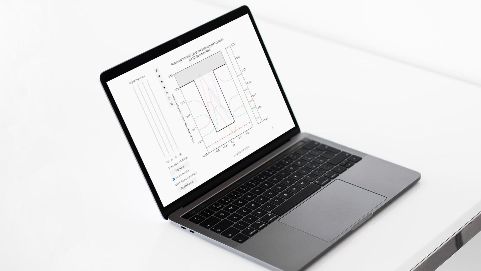
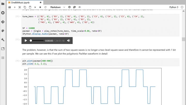
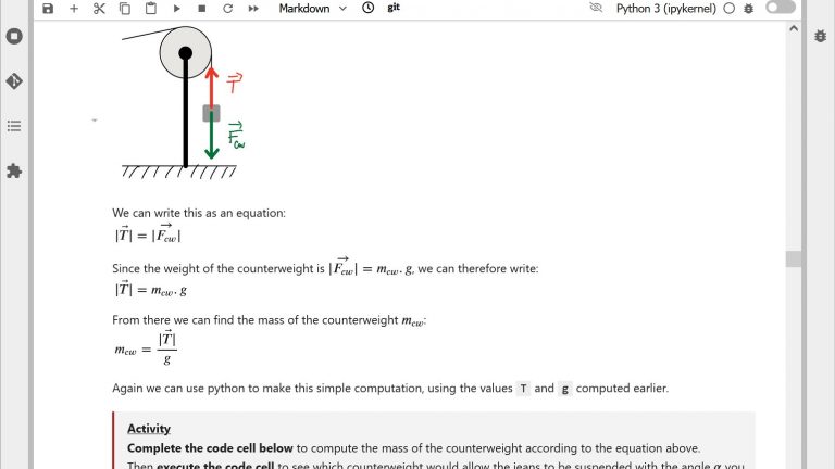
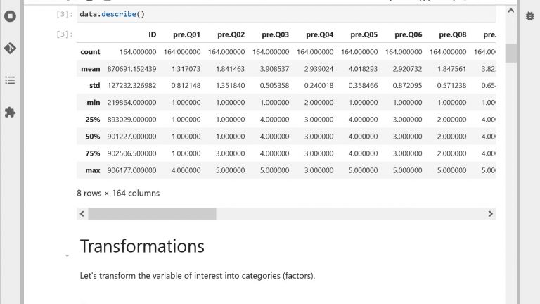
Example of virtual demonstration with Jupyter notebooks
With Jupyter notebooks, you can easily design and use digital artefacts to illustrate your explanations. But how to design effective virtual demonstrations with notebooks? And how to make sure students really learn from them in class?
On this page, we present:
- 2 questions you should ask yourself before designing a virtual demonstration
- 5 principles to design effective interactive visualizations
- 3 tips to use virtual demonstrations effectively in class
- Some Python libraries you can use
Watch Cécile Hébert explain how she uses virtual demonstrations in Jupyter Notebooks for teaching Physics
Questions to ask yourself before anything
Many virtual demonstrations are readily available on the web. Before designing your own, it is worth checking whether you could not reuse existing work, from our repository of educational notebooks for instance (paying attention to copyright issues of course). But if you need to design an interactive visualization from scratch, here is some information to guide you.
The first key question to ask yourself is what do you want students to see? The real value of virtual demonstrations is the possibility to show things that students would not be able to see with a real demonstration. Do you need to accelerate or slow down a process that would otherwise take several days or a few nanoseconds? Do you need students to see information that would otherwise be invisible, such as forces acting on an object? Do you need to display a phenomenon at scales that would otherwise be unattainable, e.g. at the atomic scale, or at the galaxy scale? If your answer to one of these questions is yes, then a virtual demonstration is a good option. Otherwise, consider using other solutions such as videos, series of images or real demonstrations.
The next question is about the type of visual representation you will use. More realistic representations help students connect it with the real world but can overload them with unnecessary details, while simplified representations help students abstract themselves from reality to better understand underlying principles but might make it difficult for them to see how it applies in real life. Often, you have to find a balance between both options: include elements that make the demonstration look realistic enough, but hide those which do not help understanding (which is one of the main advantages of virtual demonstrations!).
In addition, it is important to think about the type of representations that are most frequently used in your discipline to communicate or solve problems. For instance, Lewis structures are widely used in Chemistry to represent the electronic structure of molecules. Physicists use free body diagrams to represent the different external forces acting on objects. Students frequently have difficulties learning how to use these representations effectively and accurately. Including such diagrams in your virtual demonstrations can help students develop a better understanding of what they represent (learn more in Box 3.3, page 80 of the book Reaching Students, 2015).
Once you have an idea of an interactive visualization, in the form of a sketch on paper for instance, it is worth checking it against research-informed principles to make sure it is going to be helpful for your students.
5 principles to design effective interactive visualizations
A lot of research has been done on the use of interactive visualizations for learning. We share with you five of the most important design principles resulting from this research. You can find more details on some of these principles in the excellent “Cambridge Handbook of Multimedia Learning” edited by R. Meyer.
If your figure is a bit complex, you might need to explain what its different components represent. This is easily done orally when you present your demonstration in class but might be missing when you share the demonstration with students for autonomous use. While putting an explanatory text below your figure or in a separate legend might sound like a good idea, it will lead learners to constantly switch between the figure and the text. They will have to integrate mentally the meaning of both to make sense of the figure, which will create what is called a “split-attention effect”, shown to be detrimental to learning. Instead, it is recommended to place the explanatory text directly on the figure, with labels spatially close to the element they correspond to. You can include an toggle button so that students can hide them once they are sufficiently familiar with it, or make the text appear only when the mouse cursor hovers over the different elements.
Novices can have a hard time identifying the important elements in a figure they see for the first time. As a result, their attention might not be focused on the right things when they learn from your demonstration, therefore leading them not to see what you want them to see. Research advises using cues to highlight the important elements in an interactive visualization, and this is the “signaling principle”. For instance, you can use a bright color to highlight some elements, or on the contrary use shading to make other elements less visible. You can also use arrows, circling, labeling, etc.
This third principle applies if you consider displaying different connected views of the same thing in your virtual demonstration, for instance a physical view and a graph showing the evolution of a corresponding measure. Research shows that students have difficulties relating multiple representations together and integrating information from different sources. As a result, it is recommended to consider this option with caution and to limit the number of different representations used at the same time. If using multiple representations is desirable in your context, then you should consider helping students to identify how they relate to each other, using color coding or labeling for instance. Dynamic linking, i.e. synchronizing interactions with multiple representations such that changes made to one representation are automatically reflected in the others, can also help students.
Because of the way our sensory systems work, we have difficulty perceiving small and transitory changes in a movement. When interacting with a dynamic figure, identifying a modification requires us to memorize the state of the figure before interaction to compare it with its state after. All of this means that students may have a hard time seeing what has changed in your virtual demonstration when you/they move a slider. Providing students with visual reference points such as a threshold line or a shaded reference curve for instance, can help them make the comparisons and better evaluate the amplitude of the change. In the same way, guiding students’ attention to the important changes using highlighting can greatly help them see what you want them to see at the right moment.
When designing an interactive visualization, we usually want to make interaction with the display as smooth and fast as possible, with the idea that a visualization that is slow to respond to actions on sliders and other controls is less effective. Actually, recent research on human-computer interaction tends to show quite the opposite! For instance, Waldron et al. explain that when people have easy access to information, they tend not to memorize this information, whereas increasing the “cost” of accessing information leads to increased attention and improved processing of that information, which leads to better memorization (Morgan et al., 2007; Waldron et al., 2007).
Let’s admit it: when facing an interactive visualization for the first time, we are all tempted to “play around” with the sliders and see how the display reacts. This is, in some aspects, part of our natural way of experimenting with the world around us. But if we don’t take a moment to deliberately plan our actions and reflect on what we observe, then we don’t learn from it. Slowing down the interaction is, in a way, forcing us to take that moment and to be more intentional in our actions. So should you make your interactive visualization (a little bit) slower to respond to students’ action? Well, maybe yes…
Wondering if your notebook is well designed? Self-assess your notebook using our rubric!
3 tips to use virtual demonstrations effectively in class
If you are manipulating the virtual demonstration in class in front of students, the way you use your virtual demonstration in class can make a great difference in terms of learning for your students. What you want to avoid is students watching you manipulating the demonstration as if watching television, therefore not remembering very much of it. We share with you 3 tips to make sure your demonstrations are more than entertainment.
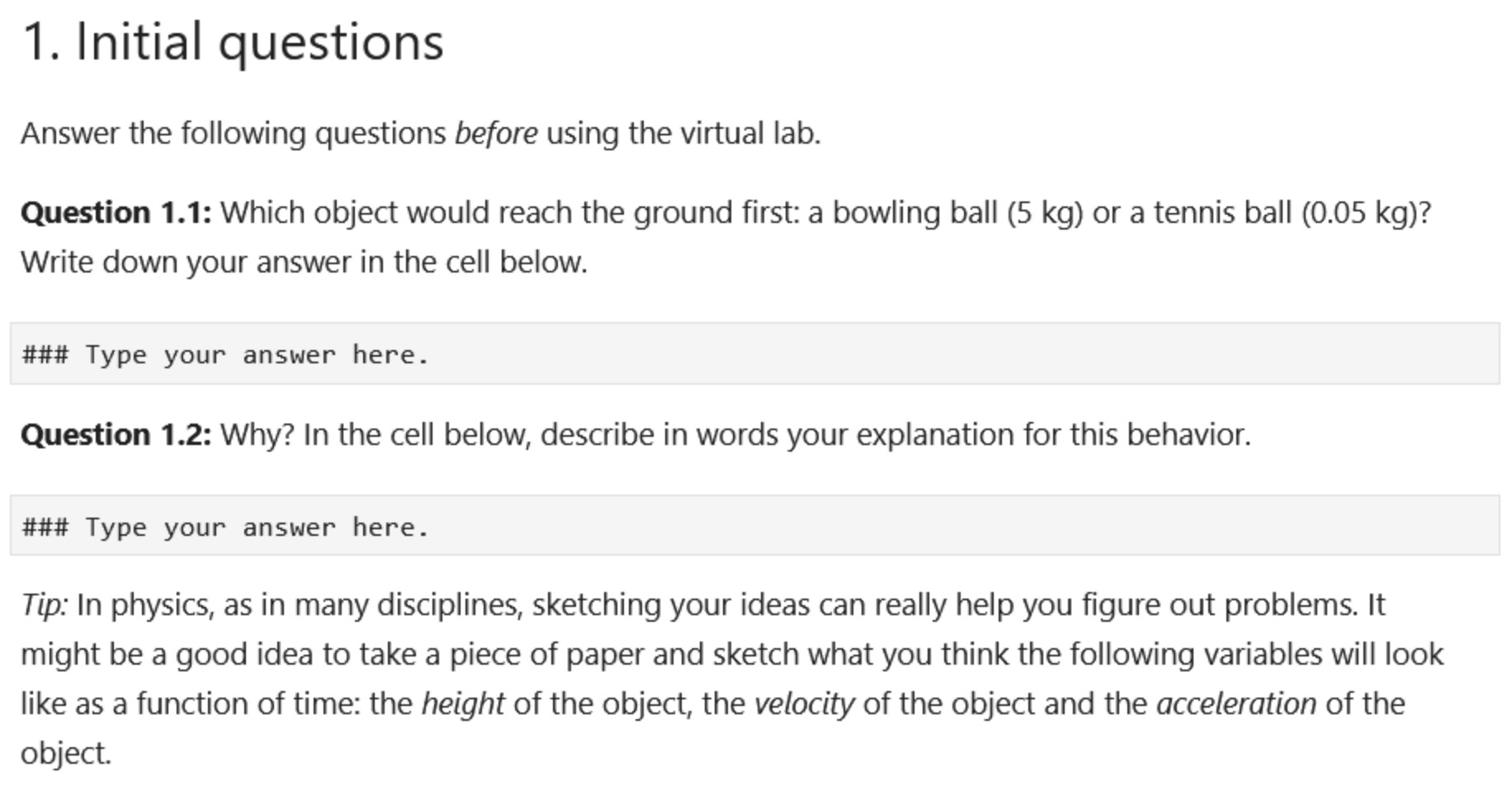
Catherine Crouch and her colleagues from Harvard University have shown that having students predict the outcome of a demonstration before observing it (prediction questions) makes an essential difference in terms of what students remember and understand from a demonstration. This result has been reproduced in a number of other studies. The reason why this technique works so well seems to be fundamentally linked to how our brain works, based on inference and prediction, according to relatively recent models. Prediction questions are therefore a key to help students engage actively with your demonstration. Before using a virtual demonstration illustrating the principles of free fall in Physics, a prediction question could be: “Which object would reach the ground first: a bowling ball (5 kg) or a tennis ball (0.05 kg)? Why?”.
When observing a demonstration, it can be hard for students to focus their attention at the right place at the right time. Asking them questions that drive them to observe specific features of what you are showing (observation questions) can greatly help them see what you want them to see. An example of an observation question in relation to the free fall virtual demonstration would be: “What differences do you observe on the velocity of the two objects? And on their acceleration?”.
Very often, students have a hard time identifying what they need to remember from a demonstration. Asking them questions at the end of a demonstration to reflect on the important points which have been illustrated (reflection questions) is a very effective way to draw their attention to the right elements. “What should you remember from this demonstration?” is a very simple example of a reflection question that you can reuse systematically. A more elaborate one for our free fall demonstration example could be “What are the criteria to decide when we can ignore resistance from the air or not when solving problems?”. To further help students, encourage them to take notes of their answers.
Usually, the “why” things happen is more important than the “what” happens in a demonstration. However, it is very difficult for students with a prior misconception to really change their understanding if they do not realize that they have a misconception. A key to effective demonstrations is therefore to give students an opportunity to formulate why they think things happen that way, as a means for them to clarify their own thinking before hearing your own explanation.
A simple and very effective tool to achieve this is peer discussion. By encouraging students to discuss the “why” with others, you give them a chance to put words on the implicit model they have in mind and to confront it to the reasoning of others. After verbalizing their understanding of the concepts, students will be better able to assess it against your own explanations, which will then have much more impact.
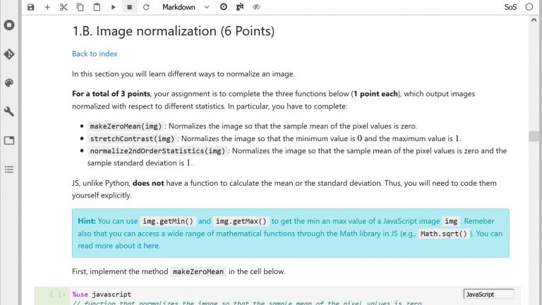
Making the virtual demonstrations available to the students after class can be a good idea. See here for information on how to share notebooks with students directly from noto. But research shows that hoping students will learn by just “playing” with it without any guidance is wishful thinking. If you want students to do more than just have random fun with sliders, make sure to include questions and instructions into the notebook together with the virtual demonstration.
Did you know that you can also encourage students to take notes directly in a notebook by integrating plain text cells (“raw” type of cell)? See the example on the figure below. Embedded quizzes (e.g. with H5P) are also a great way to engage students with your demonstration while providing them with useful feedback on their understanding. Learn how to create interactive quizzes and integrate them into your notebooks on noto here.
Which libraries to use?
Jupyter comes with a number of useful libraries for designing virtual demonstrations. In Python, you can use Matplotlib or Bokeh for 2D visualizations and ipywidgets for interaction for instance.
If you design your notebook demonstration on noto you don’t need to install anything: Matplotlib, Bokeh, ipywidgets and many other libraries are all readily available (see our documentation to get the list of all the available libraries). Don’t hesitate to contact us if you need a specific library that is not yet installed.

Matplotlib and Bokeh
We briefly present here Matplotlib and Bokeh as they are two of the most widely used libraries for building dynamic interactive 2D visualizations in Python.
First, note that they offer very similar features in terms of 2D visualization and plotting, and both work well with ipywidgets for interactivity (Bokeh also comes with its own set of widgets). Both libraries are well maintained and have highly active communities, which means you will easily find tutorials and help over the web. Finally, both require interaction with a backend server when using widgets to update a visualization. With Bokeh, you will need to start a Bokeh server (more information on the Bokeh server here). With Matplotlib, you have to activate one of the available interactive backends (more details on the different backends of Matplotlib here) so that your visualization updates seamlessly – with the default backend, your entire visualization would refresh each time the user interacts with it, which would create a “blinking” effect.
Both are therefore very good choices. However, because their support for some advanced plotting or interaction functions varies slightly (e.g. the quiver function is a bit less well supported in Bokeh), we recommend that you do some comparative testing of the features you plan to use before starting to develop your virtual demonstration.
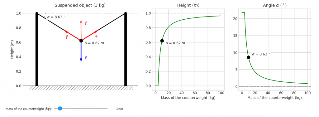
You can find different examples of demonstrations with these technologies in our repository of educational notebooks. For instance, see the notebooks by Cécile Hébert (General Physics) for examples on how to use Bokeh and ipywidgets, and see the notebooks by Giovanni Pizzi (Quantum Physics) for examples on how to use Matplotlib and ipywidgets.
Author: Cécile Hardebolle
Other resources
Discover other ways of using Jupyter Notebooks in your teaching
Bibliography
Ainsworth, S. (2014). The Multiple Representation Principle in Multimedia Learning. In R. E. Mayer (Ed.), The Cambridge Handbook of Multimedia Learning (2nd ed., pp. 464–486). Cambridge University Press. https://doi.org/10.1017/CBO9781139547369.024
Ayres, P., & Sweller, J. (2014). The Split-Attention Principle in Multimedia Learning. In R. E. Mayer (Ed.), The Cambridge Handbook of Multimedia Learning (2nd ed., pp. 206–226). Cambridge University Press. https://doi.org/10.1017/CBO9781139547369.011
Crouch, C., Fagen, A. P., Callan, J. P., & Mazur, E. (2004). Classroom demonstrations: Learning tools or entertainment? American Journal of Physics, 72(6), 835–838. https://doi.org/10.1119/1.1707018
Dehaene, S. (2011). The Statistician Brain: The Bayesian Revolution in Cognitive Sciences. https://www.college-de-france.fr/site/en-stanislas-dehaene/course-2011-2012.htm
Kirschner, P. A., Sweller, J., & Clark, R. E. (2006). Why Minimal Guidance During Instruction Does Not Work: An Analysis of the Failure of Constructivist, Discovery, Problem-Based, Experiential, and Inquiry-Based Teaching. Educational Psychologist, 41(2), 75–86. https://doi.org/10.1207/s15326985ep4102_1
Lowe, R. K., & Schnotz, W. (2014). Animation Principles in Multimedia Learning. In R. Mayer (Ed.), The Cambridge Handbook of Multimedia Learning (2nd ed., pp. 513–546). Cambridge University Press. https://doi.org/10.1017/CBO9781139547369.026
Morgan, P. L., Waldron, S. M., King, S. L., & Patrick, J. (2007). Harder to Access, Better Performance? The Effects of Information Access Cost on Strategy and Performance. In M. J. Smith & G. Salvendy (Eds.), Human Interface and the Management of Information. Methods, Techniques and Tools in Information Design (pp. 115–125). Springer. https://doi.org/10.1007/978-3-540-73345-4_15
Reaching Students: What Research Says About Effective Instruction in Undergraduate Science and Engineering. (2015). National Academies Press. http://www.nap.edu/catalog/18687
Smith, M. K., Wood, W. B., Krauter, K., & Knight, J. K. (2011). Combining Peer Discussion with Instructor Explanation Increases Student Learning from In-Class Concept Questions. Cell Biology Education, 10(1), 55–63. https://doi.org/10.1187/cbe.10-08-0101
van Gog, T. (2014). The Signaling (or Cueing) Principle in Multimedia Learning. In R. E. Mayer (Ed.), The Cambridge Handbook of Multimedia Learning (2nd ed., pp. 263–278). Cambridge University Press. https://doi.org/10.1017/CBO9781139547369.014
Waldron, S. M., Patrick, J., Morgan, P. L., & King, S. (2007). Influencing Cognitive Strategy by Manipulating Information Access. The Computer Journal, 50(6), 694–702. https://doi.org/10.1093/comjnl/bxm064
